

Christmas came early for me in the form of not one but two new issues of what’s becoming a much-beloved comic for me: Papercuts and Inkstains.
I suppose technically it’s really just one mega-issue that was smartly divided into two appropriately-sized ones (hence the 3A and 3B in the respective upper right-hand corners). Call them what you will but, whether you consider them to be one issue or two, you should definitely call them awesome.
I had the pleasure of reviewing Issue #2 of Papercuts and Inkstains a few months ago and, full-disclosure, it was one of the first reviews I’d ever written where a comic was concerned. Add the fact that Papercuts and Inkstains is a series of the indie comic variety and you can understand why I might have been a little wary about tackling the review.
What if there wasn’t much to say about it? What if I didn’t get it? Worse yet, what if I didn’t even like it?
Lucky for me, I loved it.
I could probably wax poetic about it, which I kind of did in the aforementioned review, but I’ll just skip having to run to a thesaurus to find more words for, “awesome,” and instead just reaffirm that Papercuts and Inkstains #2 was the ideal comic to bring me into the fold and introduce me to some of the wonderful indies that I’d previously been entirely unaware of… meaning when the latest issue(s) from Madius Comics popped up in my inbox I was pumped.
With good reason too because, once again, I found Papercuts and Inkstains to be a thoroughly enjoyable read and a visually eclectic look that created a solid and symbiotic little anthology.
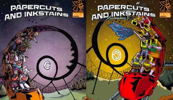
Before I get into reviewing the content of each issue, and the individual stories within them, I need to take a moment to give all the kudos to the incredible visuals that are the 3A and 3B covers. Drawn by Rosie Packwood and Mike Smith respectively, the cover pages of Papercuts and Inkstains 3A and 3B are (dang it, where’s that thesaurus I mentioned?) awesome. I personally am a sucker for some eye-catching and eye-popping artwork and each issue has both.
Once again the introductory visuals do a rather superb job at cluing you in to what should be expected from Papercuts and Inkstains: a dark, fun, rollercoaster of a comic anthology. Portraying the characters from the individual stories as the poor souls strapped into the rollercoaster was ingenious and I can’t fully articulate how good these covers look side-by-side. Also, major kudos for keeping the theme consistent for each. One could have easily decided to instead focus on doing a cover specific to the content within each part, but I think it was a smart decision to utilize the rollercoaster on both to visually point out the fact that, though split in half, 3A and 3B are cut from the same metaphorical cloth, rather, paper.
Anyways, done gushing about the covers. Let’s get into the actual stories!
Papercuts and Inkstains 3A

Story #1: A Roll of the Dice
Written by: Rob Jones & Mike Sambrook
Art by: Angela Sprecher

The story itself is a fun little heist tale that brings together a ragtag group of bar patrons and sets them on a mission to scope out a new, business-stealing, casino and, “rob the bastards fer all they got.” There’s kind of an old-school western feel to the story, empty saloons and drunkards wearing cowboy hats, which only aids in accentuating the ridiculousness that is a group of eclectic people, in a bar, getting together and planning to take down an enormous casino.
“A Roll of the Dice,” is essentially what I imagine Ocean’s Eleven would be like were it set in the Wild West and spearheaded by even more absurd characters.
It’s humorous in the sense that most of the characters are bumbling idiots who I wouldn’t trust to gamble in a casino, let alone rob one, and does a solid job of emphasizing this and not taking itself seriously in the least. The muscle of the group is a woman in a dress, the bomb expert’s mustache looks to be bigger than he is, and one of the team members is so drunk that I’m still not totally sure what his skill set is. All in all, it’s a fun read that focuses on the everyman triumphing over the bigwig corporation. Never a plot that gets old.
As far as aesthetics… I don’t know what it is about Sprecher’s art but, for me, it’s wholly reminiscent of some of the old-school Looney Tunes cartoons I watched as a kid. There’s a simplicity to the style that, for one reason or another, reminds me of the classics from Warner Brothers that would always air late at night when it was way past my 5 year-old self’s bedtime. I just kept thinking about Yosemite Sam from and all of the chaos that he got into on screen while scanning the panels of, “A Roll of the Dice.” It’s a pretty cool thing to draw something that is able to invoke such feelings of nostalgia in complete strangers, so my hat goes off to Sprecher for the accomplishment.
What I’d also like to note is one technique that was particularly helpful where in distinguishing the present from the past. The subtle rounding of the panels is a smart way of differentiating the times because it’s noticeable enough that it only took two for me to realize the implication, without being so overwhelmingly apparent that it distracted from the story.
Story #2: Vampire Wonderland
Written by: Rob Jones & Mike Sambrook
Art by: Paul Moore

Ahh, the obligatory vampire apocalypse story.
I suppose you can’t really have a sci-fi/horror/fantasy/miscellaneous anthology series without one.
Thankfully, “Vampire Wonderland,” is not of the typical variety, focusing almost more on the sarcastic internal dialogue of the main character than the actual vampires. Something that I myself am appreciative of. It’s hard to take a general idea like vampires, which has been used so often as of late, and give it large enough spin to make it interesting but Sambrook and Jones manage to do it.
Mostly because, again, the vampires are more of the subsidiary focus of the story.
The story is a quick one, not necessarily for the reader so much as the actual events in the story itself likely occur over a span of a few minutes. “Vampire Wonderland,” essentially just details how Sabi (the central character) gets from point A to point B with a hoard of vampires hot on her tail. While it could have easily been a boring affair, the story manages to pack in a decent amount of action and an abundance of sarcasm and humor. There’s something weirdly satisfying about reading puns as dad-like as, “Hey, man, lend a hand?” (in context you’ll get it) and equally satisfying are the few tidbits of information we get about the epidemic and the importance of Sabi in fighting the epidemic.
Fans of the Walking Dead will likely appreciate the necessity to decapitate the monstrous vampires, and will especially enjoy the fact that, like Michonne, Sabi uses a Katana sword to do it.

The visuals are ones that likely wouldn’t have worked as well had it not been for the actual content of the story. It’s a dark story, meaning the thick line work and heavy contrast between white and black serves to accentuate the doom and gloom of a world overrun by vampires. Similarly, because much of the comic is actually quite action-heavy, Moore seems to have focused more on motion than facial details, something that, again, actually proves beneficial.
Story #3: Slaycation
Written by: Mike Sambrook
Art by: Rosie Packwood

I’m not sure if this means I should see a psychiatrist but… I think, “Slaycation,” was by far my favorite of 3A’s stories. Both in terms of plot and aesthetics.
“Slaycation,” is picture-perfect until it most decidedly isn’t, following a group of friends as they travel to a remote cabin… almost immediately putting readers on edge. Because we all know what a remote cabin in the woods means for a group of young friends on vacation, right?
Wrong!
“Slaycation,” pretty quickly brings with it a huge twist that I didn’t anticipate and immediately takes a detour from the standard horror formula. The detour is a good one guys. It’s a really, really, good one. So good that I’m moving on to discussing the visuals because I don’t want to spoil it in the slightest.

Packwood’s visuals are just as Grade A as the twist in the story, due large in part to the fact that they have a generous combination of white, grey, and black. It’s not a two-tone comic, which means that there’s a significant amount of detail and shading within the line work. I have a particular affinity for visuals that strive to distinguish characters and setting through shading, and really enjoyed the way that Packwood managed to make so much standout despite not using any color.
As a whole, Issue 3A of Papercuts and Inkstains was another solid one from Madius. There was a nice progression from, “mostly harmless,” to, “graphically violent,” and, though not necessarily suited for a younger audience, the comic managed to remain humorous and fun throughout. I’ve said it before but the sarcasm and dark humor that always finds its way into Papercuts and Inkstains tends to be the most consistently good thing about the series.
Read about Papercuts and Inkstains 3B on the next page!
Papercuts and Inkstains 3B

Story #1: FPS
Written by: Rob Jones
Art by: Dan Butcher

This is a particularly cool story because the vast majority of it is drawn in a POV style. It takes the notion of a first-person shooter to a whole new level, following a group of soldiers as they engage in combat with a group of indigenous people on another planet. The entire story is a bit like looking down a scope, due large in part to the fact that each frame is drawn as though you’re wearing specs. You only see what the POV character sees, meaning that the visuals range from exclusively showing a scope of a gun, to showing an actual firefight between the soldiers and the people native to the planet.
While certainly a fun read, it’s actually the visuals of, “FPS,” that take the segment to another level. Disregarding the already unique POV depiction of the story, the actual detail of the images is what really sets it apart from some of the other indie comics that I’ve seen recently. They seem to be more like graphics than actual drawings and the amount of detail that was put into each panel is wholly impressive.
The story itself is incredibly short and, as mentioned, much of the action is displayed through visuals alone rather than written descriptions. The concept of one group of people coming and wiping out another for resources or intel isn’t exactly new, however, “FPS,” has a very interesting final image that manages to had a new element to the idea.
Story #2: The Perplexity
Written by: Nick Gonzo
Art by: Brian Burke

“The Perplexity,” is aptly titled because at certain points whilst reading it I was whispering, “What the f*ck?” to myself.
The story focuses on what initially seems like a standard bank heist and then promptly becomes one WTF moment after another. Though not necessarily action heavy, there are a few graphic deaths… some of which stick, others of which do not. Way more dialogue heavy than the first story of 3B, “The Perplexity,” gets real preachy, real fast. I use, “preachy,” for lack of a better word. More than anything we just get a mysterious masked figure spouting off quotes and thoughts that seem like they’d be ancient proverbs or sage words of wisdom. It’s a bit trippy in general and, while the robbers are stopped, it’s hard to say whether or not, “the good guys,” win… mostly because I still have no clue if there even are good guys.
In terms of visuals, “The Perplexity,” is another story that finds its strength through shading and a copious amount of grey. Burke’s style is unique in the sense that the images almost have a watercolor quality to them, with less focus on line work and more focus on the blending of varying shades of grey to create distinct visuals and tonal differences. The oddity of the masked character is accentuated through his visual portrayal, and would likely be just as disconcerting even if he didn’t spout of his wisdom kudos to the fact that he looks just as odd as he sounds.
Story #3: Profits of Doom #3
Written by: Rob Jones & Mike Sambrook
Art by: Mike Smith

As the only story that’s a continuation of one from prior issues, “Profits of Doom #3,” picks up where #2 left off… the world is coming to an end thanks to a deer on steroids that’s been possessed by the demon of all demons. If you didn’t think anything could get more ridiculous than a demon-deer, you were so wrong I can’t even describe it.
Let’s just say that, “Profits of Doom #3,” includes all of the following: a three-headed cat the size of yacht, a hippo that can fit an entire school bus in its mouth, a T-rex, and a, “human meatball.” No, you did not read that wrong.
The central plot of #3 involves the idiots responsible for bringing on the end of the world searching for the ancient tome that will, hopefully, help them reverse their earlier foolishness. Unfortunately, what with the whole, “end of the world,” thing, there aren’t exactly many buildings around that would have such a book. Luckily, there is one, but the cult has to make it past the crazy obstacles listed above to get there.
I’ve said it before but, “Profits of Doom,” is still my favorite of the stories featured in Papercuts and Inkstains. Mostly because, quite frankly, I find it to be damn hilarious. This cult of men in the midst of the worst mid-life crises of all times are such complete and utter buffoons that watching them try to figure out how to deal with being the literal purveyors of death is endlessly amusing. Particularly because they are quite literally the last people you would ever assume could last an hour into the apocalypse, let alone be the individuals to figure out how to put an end to it.
Mike Smith unsurprisingly draws another fantastic comic and manages to add a depth to the images that is somewhat remarkable. To insert as much detail into a comic as, “Profits of Doom #3,” has, using only black, white, and grey, is an impressive feat. That’s likely not saying much from someone who has no artistic abilities whatsoever, but it should certainly be said regardless. “Profits of Doom,” has always been one of the more visually stellar segments in Papercuts and Inkstains and that fact holds true with installment #3.
Much like Part 1, Papercuts and Inkstains 3B was another solid addition to the series. There was a decent variety of stories and, in my opinion, 3B provided some of the strongest visuals to date. What sets the comic apart from other indies currently available is the fact that it gives you more than one story. The anthology format still proves to be a strength where Papercuts and Inkstains, namely because the individual stories within each issue are well-written and interesting enough to warrant the standalone structure.
Be sure to do yourself a favor and head over to the Madius Comics online shop and snag yourself some hardcopies of Papercuts and Inkstains ASAP!
And while you’re at it, be sure to follow @MadiusComics and @AP2HYC on Twitter so you can tell us just how much you enjoyed the read!