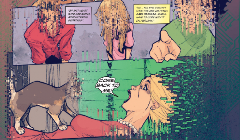
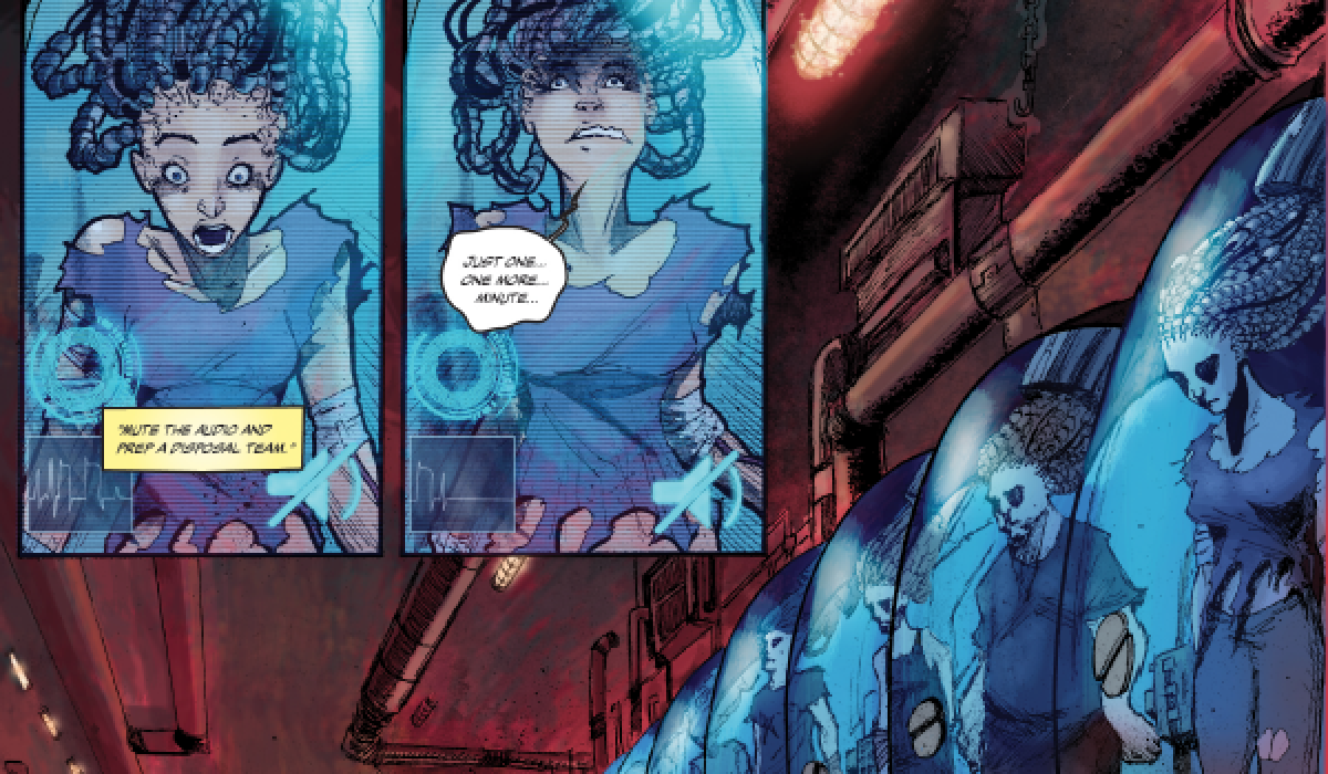
In tandem with my recent conversation with Callum Fraser, writer of the sci-fi tech thriller Peace of Mind, I am happy to present our interview with the comic’s artists and colorist, Emiliano Correa. In my review of Peace of Mind, I had plenty to say about the artwork: its intricate details, stunning use of colors, haunting robot designs, and emotive faces. Quite frankly, it was Peace of Mind‘s artwork more than anything else that drew me deeper into the world of its story. For further insight into Emiliano’s artwork process, do read on!
AP2HYC: The artwork in Peace of Mind is simply stunning and conveys some of the comic’s most powerful points. How was your collaboration process like with Callum in crafting this story?
Correa: Thank you for taking me into account for this interview. The process was very simple and fluid. Callum’s writing and ideas are very easy for me to visualise and if I had any trouble he would be always there to help. My process consists of reading the script before proceeding to the layout. Once Callum approves it I go to the next level: pencils and inking until the pages are ready for me to color them digitally.
AP2HYC: How did you settle on the color schemes you use for the VR world and the underground?
Correa: I love it when comics and movies create the perfect setting for each story; it allows the reader to be part of the story. I wanted to achieve this by separating each location with different tones. For the sewers, I wanted it to be dark and gritty to show how the main characters lived away from the rest of the world. As for the VR world, my intention was the opposite; it is a delusion where all is neat and utopian in the eyes of the beholder.
AP2HYC: With futuristic sci-fi, so much of an artist’s job is to create things that do not already exist. What inspired you in your design of this dystopia, its robots, and other future tech?
Correa: I spent hours studying cyberpunk illustrations and movies. My main resource was researching illustrations, trying to capture the essence of how they make non-existent devices and artifacts work, and how to fit them into the style we wanted.
AP2HYC: Faces seem really important in this story: whose we see, whose we don’t, and the robots and computer programs that don’t have them. What is it like to draw such nuanced human characters and how do you choose what to show in a given panel?
Correa: First of all, I really enjoy drawing faces and, in my opinion, it’s important to show the characters’ expressions to make it easy for the reader to follow the story and understand the situation. There might be a lot of dialogue and variation is vital to keep the reader interested. Some helpful features to achieve this might be showing a bunch of expressions (that fit each situation) and changing the shot’s angle from panel to panel. Otherwise we would have just a lot of mid-shot panels with no personality.

AP2HYC: I thought the bordering of many pages was really inventive and something a reader doesn’t often notice when going through a comic. What was your thought process for designing the layout of the issue?
Correa: This was initially thought (by Callum and I) to be a strange decision, but we like how it turned out. When some of the pages were colored, I felt something was missing [and that] the borders were too white or bland. So, I started experimenting and liked the results. I felt that variety helped break the monotony of a standard border and helped integrate the art with the story.
AP2HYC: What did you enjoy doing the most on Peace of Mind?
Correa: Everything, honestly! I enjoyed taking the script and putting it onto the page. The script kept me excited about what would happen in the next panel or page. Character wise, I enjoyed drawing/designing Mickey and Jenkins.
AP2HYC: What was the most challenging to design?
Correa: As this comic was a long time in the making (it was initially a short comic), I found going back to old pages that were a year old to be quite hard and challenging. Not only to re-discover what I’d done, but also because I found some things I wasn’t happy with. Such is the life of an artist, I guess! Overall, I would say that the most challenging thing to create/design in the comic was the technology Callum described and [how to] make it look interesting.

AP2HYC: What are some of your comic inspirations, visually and story-wise?
Correa: I am a big Batman fan, however I usually prefer non-superhero comics, for example Black Science, Low, Hellboy, Chrononauts, Tokyo Ghost, Reborn, etc. Visually I took some inspiration for Peace of Mind from comics such as Black Science and Tokyo Ghost.
AP2HYC: What can we look forward to from the two of you in the future?
Correa: We are now working on Peace of Mind #2, and we have another project waiting to be finished at a later date. I hope we keep working together because I really like how Callum writes and his ability to create these crazy and interesting stories is fun to work with! We both share the same interest in sci-fi and horror, so there’s a good connection.