Written as a pseudo-anthology, Papercuts and Inkstains finds its cohesion through the combination of bizarre characters and even more bizarre tales, each of which has a certain Twilight Zone vibe to them. Though each story differs from the next, there is a unifying focus on the strange, weird, and unexplainable that makes each individual section of the comic seem to follow the, “multiple episodes within an episode,” format of the old TV series
The breakdown of the comic into three mini-comics actually strengthens each individual story by allowing readers the rare opportunity to actually stay focused on the differing plotlines. People these days seemingly have shorter and shorter attention spans, which makes the sectioning of Papercuts and Inkstains into more concise 8-10 page short stories almost preferable to the standard single-story format that most comics seem to follow.
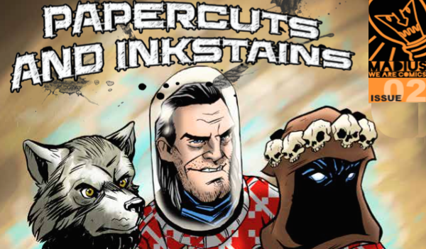
The hodge-podge mixture of characters and stories becomes apparent at first glance, considering the front cover of Issue #2 is a perfect encapsulation of what Papercuts and Inkstains seems to be about.
With characters from each of the three stories of the comic crowding together and stuffed into matching sweaters for the most awkward of awkward family photos, Jim Lavery’s front cover makes it clear off the bat that readers are to be treated to a truly bizarre melting pot of characters and stories alike.
As mentioned, this issue of Papercuts and Inkstains is comprised of three short stories, only one of which is a follow-up to a tale told in the first issue of the series. Other than the running theme of sci-fi supernatural, the stories have no link to one another in terms of plot, making each a uniquely enjoyable read.
Cast Adrift
Written by Rob Jones and drawn by Rory Donald, the first of the three stories included in Issue #2 of Papercuts and Inkstains is very much reminiscent of James Cameron’s Aliens.
Abandoned colony on a foreign planet? Check.
A corrupt, military-run, government? Double check.
Humans that are deemed expendable for the good of scientific research? Triple check with a few dozen exclamation points to follow.
This section in particular seemed like one that could have easily been inspired by the Asimov approach to storytelling. As mentioned, Cast Adrift takes place in some distant time in the future, on some equally distant planet, and is rife with the sci-fi lore that makes the story seem like an homage to the aforementioned film from the 80’s.
It’s very much the type of story that has your mind sub-consciously playing an ominous score in the background as you move through the frames trying to figure out what awful thing might happen. The vague allusions and lack of information means that it doesn’t take long before you know something will likely go terribly wrong, which actually adds a fair bit of suspense in the interim.
The story’s central character, Cruz, is woefully ill-informed about the mission he’s sent on, which means that, because he serves as the reader’s eyes and ears, we are just as unaware of the events about to transpire. Though not a mystery per say, Cast Adrift certainly utilizes the common mystery elements of suspense and misinformation as a means of keeping readers in the dark for as long as possible.
The interesting takeaway from this story is the fact that, even X years into the future, humans are very much their own worst enemy.
Together Forever
Together Forever is a story that immediately caused a feeling of nostalgia for me as I was taken back to a childhood of after-school episodes of Goosebumps and Are You Afraid of the Dark?
Much like those episodic horror mysteries, Together Forever plays with the idea of having a central event that serves as the catalyst for the rest of the story. It’s yet another off beat tale that deals with the supernatural in a way that is equal parts humorous and grim when a police task force is sent to investigate the disappearance of a missing family man.
With Together Forever, readers are slightly more in-the-know than the characters within the comic, due large in part to a mid-story flashback that very clearly shows what happened to the missing father. Once readers become cognizant of what is happening, they are left with a general sense of how the remainder of the story will progress. It’s certainly not a comic that requires an abundance of brainpower to understand, but that’s what makes it an enjoyable read.
You almost immediately know what will happen next, but said knowledge doesn’t stop you from turning the page anyways.
The presence of werewolves (or perhaps they’re just very large were… dogs?) makes the story more supernatural than mysterious, but there’s still enough gore and action thrown into the mix to make it seem like a modern horror.
Profits of Doom #2
Of the three stories, Profits of Doom #2 is the only one that serves as a continuation to a story published in Issue #1 of Papercuts and Inkstains.
The second installment of this tale is just as humorous and witty as the first, and doesn’t hesitate for a moment when presented with the opportunity to land a solid joke.
The story, following a group of (assumingly) middle-aged men who spend their free time in a demon-summoning cult, is quickly becoming a favorite of mine. As in… if you haven’t read Issue #1, do so at your earliest convenience so that you can fully appreciate the introductory story of the Boobdae group.
Profits of Doom is, in my opinion, a perfectly executed take on the dark-comedy genre, mixing death and destruction with genuine humor that actually managed to get a view audible laughs from me. Rob Jones and Mike Sambrook have written this so well due to their focus on emphasizing the general absurdity of the situations and effectively combining genuine wit with more gag-like humor.
Profits of Doom takes the concept of a mid-life crisis to a hysterically new level by creating characters that are so dense and oblivious to their surroundings that you wonder how the hell, in a world with literal monsters running amok, they’re still alive.
Perhaps the only qualm that I have with Papercuts and Inkstains is the fact that it tells these darkly humorous tales with a heavy emphasis on dark.
As in the entire comic is in black and white.
Now, I’m well aware that there are multiple variables that surround the decision-making process of creating comics, and that there was likely a very specific reasoning behind the choice to have this particular comic be in black and white, but as a reader, I couldn’t help but think about how drastically different the stories would appear were a bit color infused between the lines.
The stories are so intriguing, with both characters and settings alike being vastly different than anything we see in real life, that it seems almost like a disservice not to fully highlight how awesome they are through the addition of even a little bit of color.
The black and white quality of the comic actually made it more difficult to follow along with some of the plots, in the sense that it took more time to process what was actually being seen on the page (Particularly in Cast Adrift, which heavily emphasized black over white, making it a bit of a struggle to distinguish one thing from the next). Double takes were frequent and flipping back in order to reread, or relook at, a particular frame was necessary in order to actually comprehend what was going on.
This isn’t to say that the images within the comic aren’t great in their own right, they definitely are, but with such delightfully absurd and offbeat stories, it seems strange not to emphasize the strange through the use of color. The quirky oddities are what really make these particular stories great and set them apart from other comics. But, man oh man, color would set them apart and put them in another league all together. Everything about the stories of Papercuts and Inkstains is just so, damn, cool, which makes it seem even odder not to make the visuals as stunning as possible.
The fact that I got genuinely excited to see grey goes to show how much of an effect even slight shading can have on a story.
Repeat: I got excited about grey.
A color normally overlooked or deemed inconsequential to most people, when used in Profits of Doom, had an enormous impact on how I read the story and perceived the visuals. The slightest shading completely transformed the story and made it seem infinitely more engaging than it would have been if drawn in black and white alone.
The monochromatic palette of the comic, though not necessarily unusual, just didn’t seem to fit such vivid and fantastical stories.
i.e. A recon mission in space surrounded by other planets.
A gruesome, bloody, crime-scene post-werewolf attack.
And a deer on steroids, sitting in the middle of a floating monolith, and controlling a summoned monster to destroy the world.
To me, each of the above deserves to be seen with all of the insane colors that my mind tries to conjure up while looking at them.
But, perhaps that’s the point.
Maybe the intention is to have readers look a little closer, stare a little longer, and be a little more focused when reading Papercuts and Inkstains.
Have you read Papercuts and Inkstains yet? What are your thoughts on the mini-stories within? Sound off on Twitter or in the comments below!


