Plainer Jane is enigmatic and charismatic. Written by David Willburn, drawn by Wayne Lowden and Ralf Singh, with colors and letters by Robert Last and Tim West respectively, the first issue takes a peek into the psychology of a hired assassin. Our protagonist, Jane, has a taste for blood and kill counts. She’s stoic in writing, sarcastic, and exudes cool confidence. But her morbid curiosities and wonder pull her into the dark web. From there, she makes a name and a living as a killer-for-hire.
Right off the bat, the cover grabs you; a cool looking girl – cliché and all complete with her pink bubble gum – sits on her bed, on top of a pile of bloodied corpses. Just from that alone, one can deduce that this is no ordinary girl. That you, as the reader, are in for a wild ride. Singh does a great job at setting a precedent for what is to come without giving too much away. Flip to the next page and there lay the credits, dripped in black ink. The chapter title – “A Means to an End” – is ominous, yet sparks further interest. Overall, this page stands as a good foundation and introduction into Plainer Jane’s schema of art and color.
Always surprising, the first line catches you off-guard; “Disguises are simple,” Jane says, kicking the story off with straight to the point rhetoric. Her tone is insincere, but she speaks no lies. As a character, Jane is stealthy and deceitful. Her speech is flat and dry, but reveals no dark intentions despite what the actual text says. In thought, she goes through each of her motions with no fuss. When speaking to other characters, she puts on a certain cadence and voice easily read between the lines. Use of vernacular adds personality to her characterization and highlights her sarcastic nature. There’s something in the juxtaposition of her manner of speech when she’s thinking, and when she’s engaging with others. This is perpetuated by the text box and speech bubble layout strewn across the inked pages of the graphic novel.
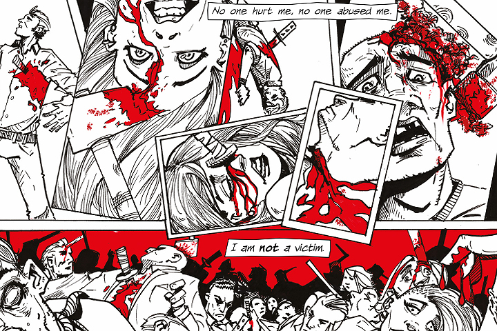
The actual comic is in black and white. No, not monochrome, grayscale, or achromatic. Just plain black and white. No shade ranges, only plain black and plain white. Which is testament to this “plain” façade of Jane’s. However, red bleeds through specific panels, indicating the darkness hiding within her. This color scheme accentuates facial features; it makes clever use of line and strokes to fully flesh scenes and characters out. It works, but is a little sharp to the eyes if one is not used to the heavy contrast.
Plainer Jane has a lot to offer. This issue in particular focuses on the lead-up to Jane’s killings. Willburn is brilliant in writing tension, building it up, and keeping readers on their toes. He uses the mix of internal monologue, narration and flashbacks to paint a picture of who Jane is. The flashbacks are quick and dry with not much transition between each one. Within these flashbacks, although simple, the art draws you in with every small little detail. From the variety of faces surrounding Jane, the innocence drawn onto the eyes of her animal victims, to the splashes of red that breaks the uniformity of the black and white pages.
It’s interesting that Jane calls her experience with the pigeon her “first professional kill”, despite only earning 50p. There’s something far more sickening about these string of events when she describes it as so. This sense of unease with her character is only amplified by the showcase of childlike drawings that list off all her practice kills. It’s sinister, disturbing, and induces the right amount of intrigue and anxiety. And it’s through these drawings in which the choice of black and white truly shines as a storytelling device. This impish glee on her portrait of herself; the stark contrast of the two colors; the overbearing presence of lines. All of that makes for morbidly entertaining pieces of art.
A particular page within one of the flashbacks might just be my favorite. Art, color, and text clash to showcase Jane’s descent into more violent murders. It starts with the small blobs of red on the Christmas tree baubles as she describes her perfectly normal life. This then bleeds into the blood littered across photographs of people she’s killed. Further and further down the page, the red takes over the white. So much so that there is no longer a speck of light left. “This is just business,” she says, and this truly reflects her succumbing into the darkness within.
Truly, the best part of this issue is the heavy insight into Jane’s childhood. Her experiences and the things she did as a kid are interesting to learn. Although they strike as only odd at first glance, they later heavily foreshadow her future dealings. Again, Willburn’s writing is brilliant as he presents no actual change in Jane, just a culmination of something sinister. The inherent unease she’s presented, even from that first ever cover page, is perfectly framed by the quick recap of her childhood.
Plainer Jane is fantastic. Hell, even the closing page leaves a lasting impression. The panel of Jane letting the dog bite her as she feeds him his poison stirs something uncanny. This leads up to the last panel of the comic; Jane stands over the dog’s dead and slumped body as another assignment beckons for her. Not so much a cliffhanger, but a perfect set-up for the next issue. Again, it touches on one’s darkest curiosity whilst still remaining consistent with the rest of the comic’s tone.
Curious about Plainer Jane? Want to see for yourself how unplain our plain Jane is? You can purchase #1 at Comixology if you’d like to join the dark side. Let us know if you enjoy it by commenting down below or sending us a tweet at Twitter!